Look Design:
designing the visual identity of a story
When we talk about look in film and advertising we tend to think of the final stage: a color correction, a LUT, a last-minute creative tweak. In practice it is exactly the other way round. A look is not "applied" at the end: it is designed from the very beginning.
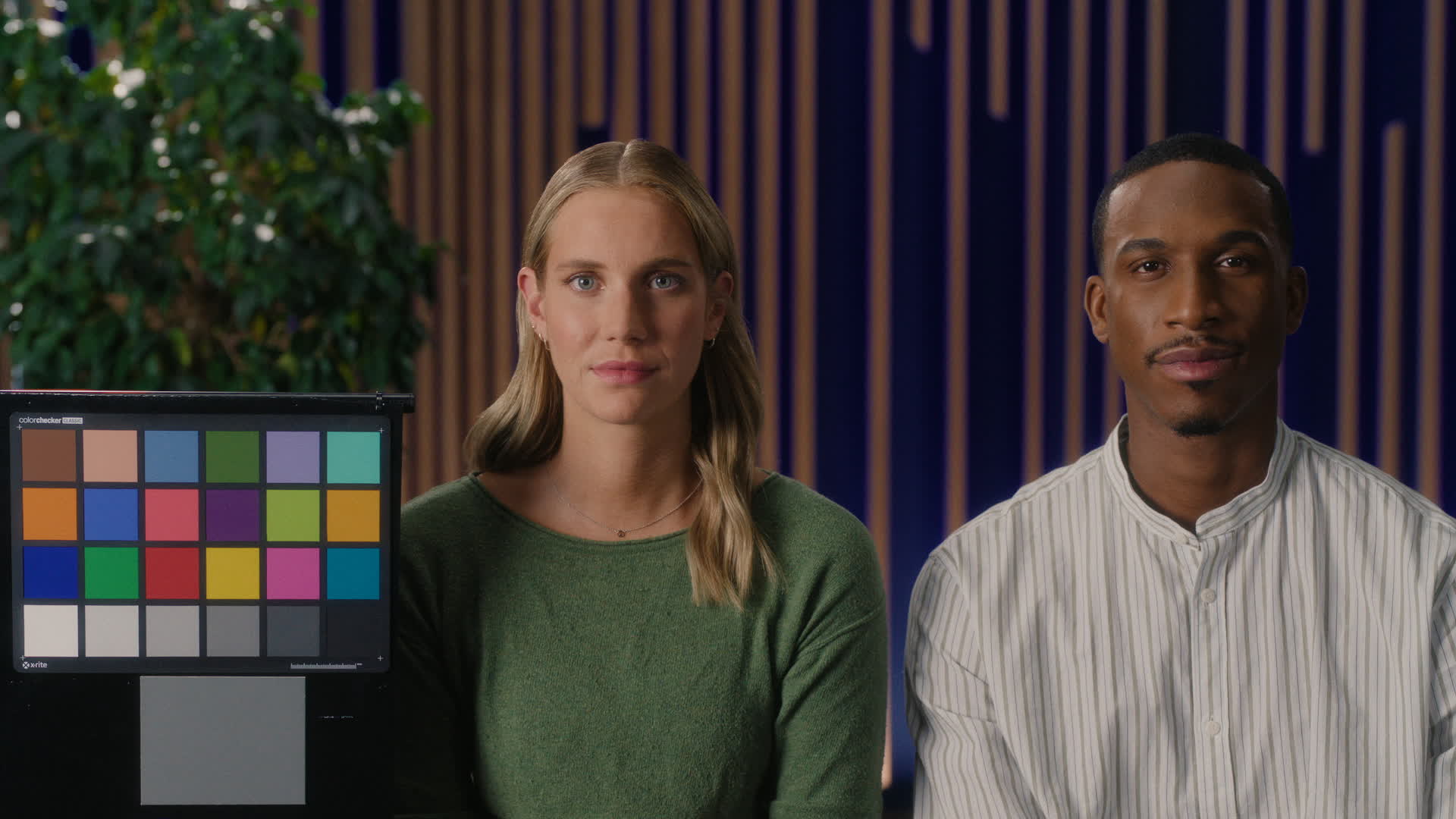
Look Design is a creative, technical and narrative process that defines how a project should feel visually before the camera turns on. It is the root from which the decisions of photography, art direction, make-up, lighting, VFX and, of course, the final grade all grow.
The starting point: the look book
The process begins with a document of intent: the look book. It is where the aesthetic vision of the project is condensed and where the creative team aligns around one shared visual language.
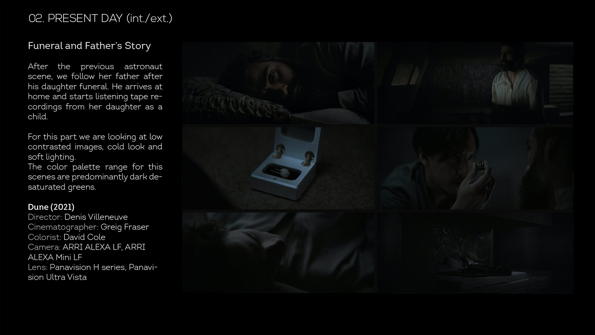
In it we gather pictorial and cinematographic references, color palettes, qualities of light, desired textures and emotional sensations. The document is built together with the director, the cinematographer and the art department, and becomes the compass of the project: without a look book there is no look, only scattered intuitions.
What is a look made of? Three fundamental pillars
In a professional environment a look is neither a filter nor a preset. It is a visual architecture built on three pillars that always work together: contrast, color palette and texture.
Contrast: the emotional structure of the image
Contrast defines the backbone of the look. It sets the separation between highlights and shadows, the depth of the black, the behaviour of the high values and the sense of volume in skin and spaces. Hard contrast can turn a scene into something tense and cutting; soft contrast can take us to an intimate, enveloping register.
Color palette: the emotional grammar
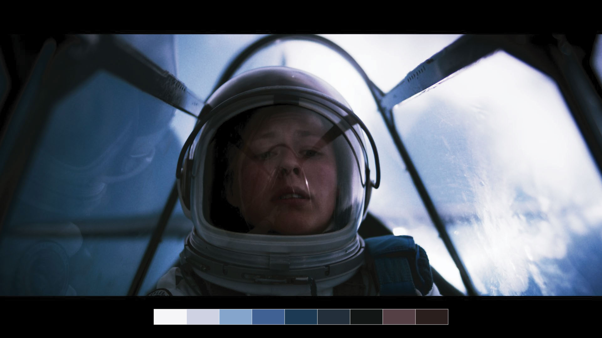
The palette organises how the colors of the film or campaign should behave: aesthetic dominants, levels of saturation, the relationship between primaries and secondaries, the treatment of skin tones and which colors should stand out or stay in the background. A palette does not simply "beautify" the image: it is pure visual dramaturgy.
Texture: the soul of the negative, digital or analogue
Texture covers everything that makes an image breathe: grain or emulsion simulation, micro-contrast, halation, perceived sharpness, optical response, controlled aberrations or atmospheric density. It is probably the most subconscious component of a look and, at the same time, one of the most powerful when it comes to evoking analogue cinema, digital hyper-realism or documentary rawness.
Film grain is not cosmetic, it is a chemical reaction. Most digital grain is a "layer" laid over the image: it simulates noise, not behaviour. Grain modulation must be relative to contrast, with diffusion in the highlights and real halation, and its distribution must respond to density across every luminance zone. At LORENZO Colorlab we treat texture with the rigour it deserves.
Designing a look is, in the end, designing how contrast, color and texture interact in order to tell a story in a recognisable and coherent way in every single shot.
The science of the look: camera tests and technical trials
Once the aesthetic intent has been defined, it has to become something reproducible in camera. To do that we run camera tests and technical trials that let us understand how the sensor responds under different conditions.
We work with LAD cards, color charts, exposure variations, different color temperatures, optics and filtration. These tests lay the foundations of the "creative negative" of the project: a starting point on which we can build a stable, reliable look throughout the shoot.
From intent to tool: building the design LUT
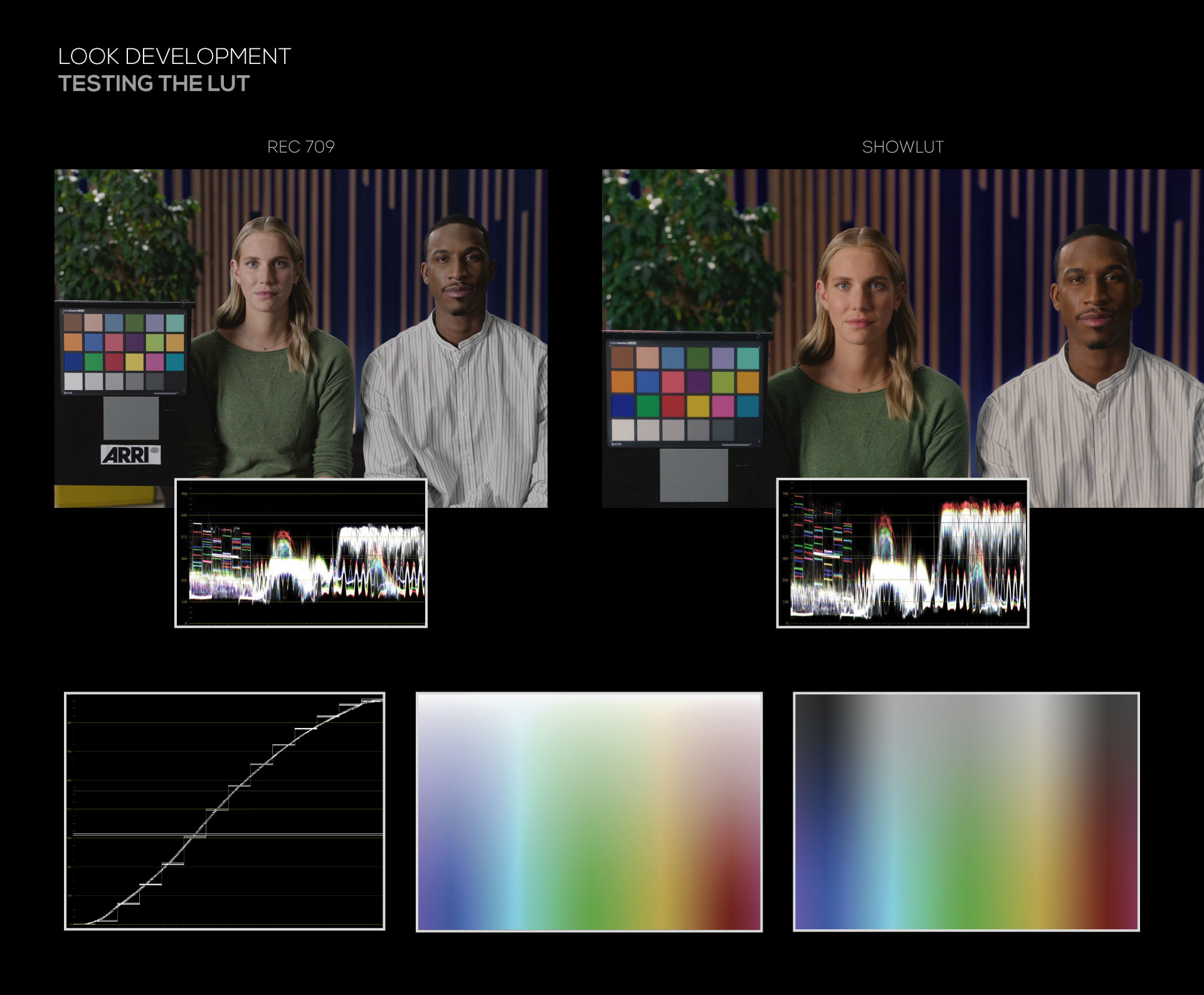
With the pillars clearly defined and the camera tests done, we move on to building the design LUT, the "digital negative" that travels with the project during the shoot. This LUT is not the final look, but it is its operative translation: it lets direction, camera and edit see an image consistent with the original intent while the project is alive.
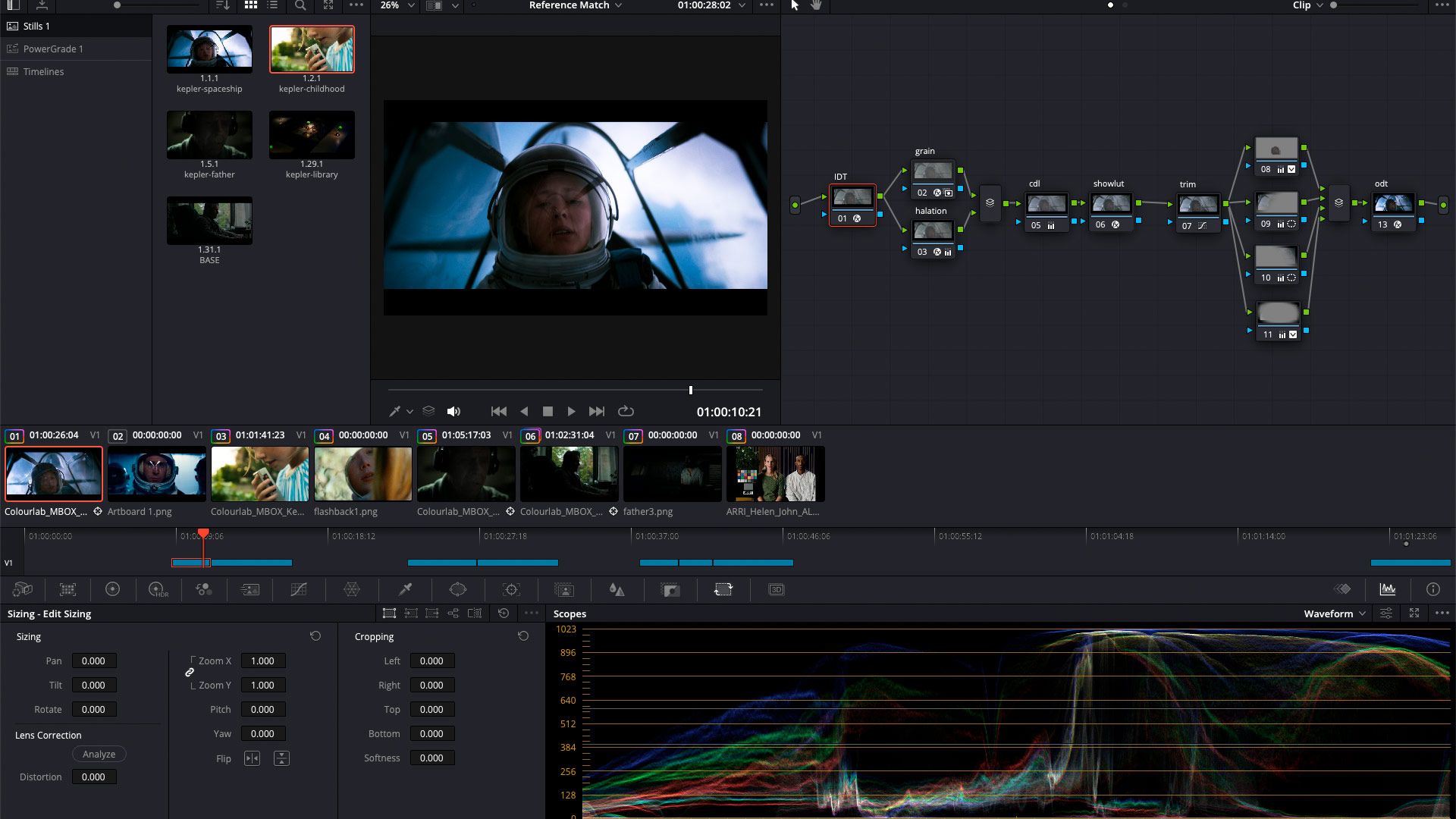
At LORENZO Colorlab these LUTs are built in DaVinci Resolve on color-managed workflows (such as ACES — Academy Color Encoding System) and can incorporate specific sensor responses, textures simulated with different tools, as well as custom DCTLs (DaVinci Color Transform Language) when the project calls for it.
LUT stress tests: making sure the look holds
Before signing off a design LUT we put the look through a battery of stress tests. The aim is to guarantee that the image stays stable and believable in extreme situations:
- Behaviour in high and low values.
- Response across widely varied skin tones.
- Scenes with extreme dominants (sodium, neon, fluorescent, and so on).
- Different exposure levels and shooting conditions.
- Use in exteriors and interiors with very different contrast.
A LUT that breaks under these tests is not a look: it is a risk that will sooner or later show up on set or in post.
From set to color suite: coherence across the whole pipeline
A well-planned look design does not end on set: it extends along the whole pipeline. In post, the work rests on color-managed workflows (ACES 2.0), HDR / SDR deliveries, Dolby Vision profiles and specific transforms for VFX and online, so that the image keeps its visual identity at every stage.
When Look Design is properly built, the colorist does not "invent" a look at the last minute: they complete it. They adjust, refine, shape and take to its fullest expression something that was already born in pre-production.
Look Design at LORENZO Colorlab
At LORENZO Colorlab we see Look Design as a central part of our work in film, series and advertising. We combine research, cinematographic sensibility and color science to design looks that are both emotionally powerful and technically solid.
Our work includes:
- Look books for film, documentary and advertising projects.
- Creative LUT design for shooting and editing.
- ACES 2.0 workflows and HDR / Dolby Vision deliveries.
- Film stock and cinematographic texture emulation.
- Visual support from pre-production through to the final master.
If you are developing a project where look, color and texture are an essential part of the narrative, we can design the visual identity it needs with you from day one.
Let’s talk about the project